Comparing transportation costs in Vienna - A R/Shiny example project
 With some time during my holidays, I took part in the Open Energy Data Challenge 20171 organized by the City of Vienna council. The aim of the project was to come up with an original idea for putting the publicly available data of the most recent energy report2 to good use.
Looking through the data
For this, all participants received numerous excel files that contain all the data in a neat tabular form and additional visualizations used in the report. There were a lot of different attributes, but at the first glance, it was hard to put something useful together. The data included everything about consumption, prices and distribution of energy. By energy, everything was included - Fuel to power cars, electricity produced by various sources like wind farms or coal plants, and so on. It was split up into data on industry and private homes. Some of the attributes concerned only Vienna, some only different states, some information was only available aggregated on the whole of Austria. Some were only measures for the year 2013, others included dates back to 20, 30 years ago. It was a mess.
I first wanted to make a cool map-based visualizations that the user could manipulate, but the data was clearly not cut out for that. But for what was it, then?
Well, after carefully looking through each single file, I noticed there was some interesting data on car usage, fuel price, yearly ticket costs for public transport and other transportation-related items. I decided to do a visualization to compare what the average Austrian citizen spends on public transport with what he would spend on fuel using a car.
Building the project
Using Shiny
I used the R Shiny web framework for this. It is a very intuitive way to bring R programs to the web. In short, you write all the app in R in this form:
|
|
All the layouting information comes into ui, all the data access, manipulation and usage of visualization methods go in server. Then, you need to connect the pieces in the server to the interface elements in ui. A great tutorial and everything you need to know you can find on the dedicated shiny page. I used the solarized theme for the plots and the flatly theme for Shiny.
The final product
The web app is split into three parts:
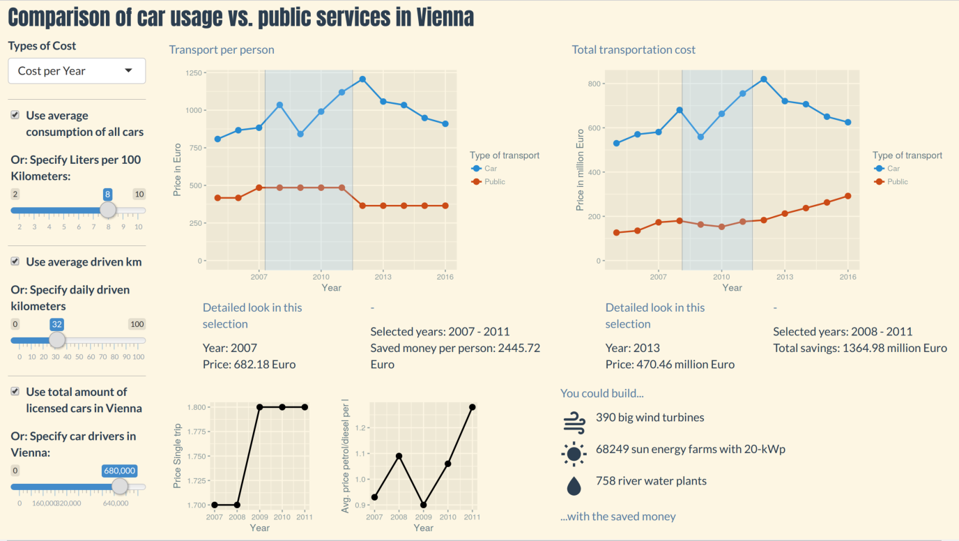
On the left there are the user control to manipulate the visualizations. We can modify the car consumption, daily drive kilometers, how many drivers are present in Vienna and if we want to have cost per year or daily costs. If you don’t specify certain values, you can tick a box to use real (averaged) values.
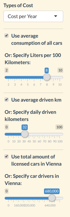
In the middle there is the display of transport cost per person plus miniature visualizations on price developments. Price developments are visible if an area in the visualization is selected. These are how the prices are calculated from the data:
- Public transport: Year card price
- Car usage: Car km per day * Fuel price * Car Fuel Consumption
If cost per day is selected, prices are divided by 365. Not all the information I needed here was to be found in the energy report2, so I had to find other sources as well3. Missing values between time points were estimated via linear and LOESS regression.
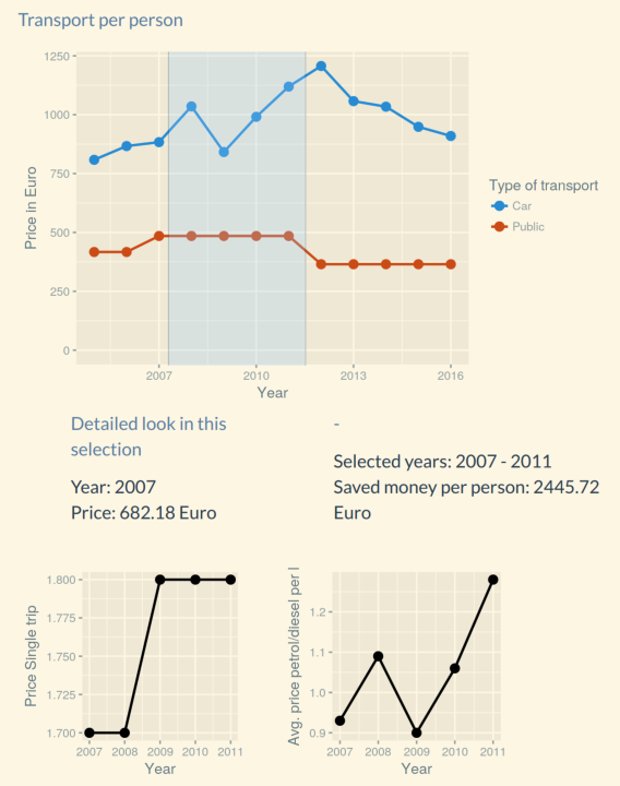
On the right, we see the total cost of transportation of all persons according to these formulas:
- Public transport: Year card price * Total tickets sold
- Car usage: Car km per day * Fuel price * Car Fuel Consumption * Total number of cars
On the right bottom, there is an indication on how many sustainable energy plants could be built with the money that was saved from buying fuel for car when using public transport. For this, an area must be selected on the right top visualization.
Please check out the final product, and dig into the sources if you like!